Monday 9 September 2013

Juxtaposition

2013.09.04.Juxtaposition-Diver
f/8  1/25  ISO-800
Focal length 55mm using a 55-250mm telephoto lens
I am a keen diver and member of a club, so decided to take a picture of a fellow club member for this exercise.  A picture of someone wearing all of their gear or in a wet / dry suit seemed a bit obvious.  I felt that a picture at the pool would be better, and an indication of training or practice for "real diving".
A diver's equipment is their lifeline, or their buddy's if needing assistance, so there is obviously a strong relationship.  In this image, the diver is checking the pressure gauge, making sure there is adequate air and the equipment is set up properly, ready for use.  His dark clothes merge with the black of the BCD (Buoyancy Control Device) and tubes, symbolic of the close relationship.  I preferred this image to another in which the subject was standing, as he appears smaller in relation to the equipment, giving fairly equal emphasis to both.

Monday 2 September 2013

Rain

2013.08.31.Rain
f/5.6  1/200  ISO-800
The most obvious symbol of rain is an umbrella.  I wanted to use an item that can clearly be associated with rain, not as clichéd as an umbrella, and not to reveal the whole form, leaving more to the imagination.  Also, something that could get wet.  I chose a pair of black wellington boots and experimented spraying water from a hose and taking photos with various shutter speeds.
Although the shutter speed for this image is not especially low, the speed of the water flow and holding the camera by hand combined to create some blur and distortion.  I didn't want a clear, highly defined image, partly because wellington boots are not the most visually pleasing of subjects, and also to make the image original.  The angle of the spray and the blurred streaks give an impression of heavy, driving rain, producing impaired visibility.

Wednesday 28 August 2013

Phoebe Rudomino

Phoebe Rudomino: http://phoeberudomino.com/home.html

At the 'Out of Focus' exhibition at Saatchi Gallery last year, one of my favourite images was 'The Girl in a Room', a still from Johnson & Johnson's 'Imagine' Total Hydration body wash TV commercia (see porfolio on PR's website)l.  As a keen diver who enjoys underwater photography, it was interesting to see and underwater photograph that was not of fish, or the natural world.  This was a staged and planned image.  Rudomino is based at the Underwater Stage at Pinewood Studios.  The submerged set is lit in a subtle yet precise manor, some lighting from above creating some contrast on the model, light on the "windows" creating some depth perception.
In Rudomino's 'Plastic Soup' collection, there is interesting use of materials, coloured liquids, props and lighting to create original and eye catching images.  She also puts the different elements together to convey her message(s).  I particularly light '250 million' 2011.  The title and the 'Plastic Soup' theme suggest a reference to plastic waste in the oceans.

Evidence of Action

2013.08.18.EggShells-EvidenceOfAction
f/6.3  1/25  ISO-200

The premise for this image is fairly simple, evidence of having cooked eggs.  I took various shots with different arrangements of the egg shells, and from different perspectives.  Placing the eggs on some kitchen towel shows that they have been used and not accidentally broken.  The simplicity of this shot and attracting the viewer to the broken shell at the back led me to select the image.  It was originally taken in monochrome and I changed it to colour editing the RAW version.  I felt the colour version worked better, with the only colour really on the outside of the shells, which made them stound out more from the background.

-------------------------------------------

Examples of concepts often depicted in advertising:

1. Desire
2. Quality of life
3. Status
4. Sexuality
5. Insecurity / fear

Other images that insurers use: Telephones (depicting you can talk to them and they are there to help), things that they cover such as houses, cars, pets, travel (e.g. suitcase, beach chairs etc), pen and paper, money, stethescope, life buoy.


Sunday 18 August 2013

V&A - 17th August 2013

The collection at the V&A shows photography from its beginnings through to more recent times.  Essentially, it shows a history of photography, in terms of both processes and styles, without any current and contemporary work.

Some of the early works on display showed rather painterly qualities.  I got this impression not just from the grainy appearance, but also the subject matter and composition.  'The Old Farmhouse' by Francis Bedford, for example, can easily be imagined as a painting.  Somewhat surprising then that 'Figures at the Fountain of Sultan Ahmet III, Istanbul' by James Robertson and Felice Beato was taken seven years earlier, in 1853.  The detail in a photo taken at this period in time genuinely amazes me.  In contrast, Peter Henry Emerson intentionally created images that were not sharp and detailed throughout, to create a look similar to Impressionist painting.  He did indeed collaborate with a painter, creating publications on rural life.  'In the Haysel' is the Emerson image displayed at the V&A, and it certainly achieves his aim of creating a "painting style" of photograph.

Another image that stood out for me was 'The Cloud' by Alvin Langdon Coburn, taken in 1906.  Simple yet effective.  He explored the design concept of 'notan', involving balancing light and dark proportionally.  Perhaps there is some symbolic message, with the light cloud emerging for the dark, or dark cloud covering the light.

Moving on to the late 40s / early 50s, a couple of photos by Robert Doisneau caught my eye.  'Café Noir et Blanc' and 'Le Petit Balcon' are light hearted, and poignant observation of human emotions, in which you can sense contrasting moods of different people within the images.  In 'Le Petit Balcon', for example, the amusement on the faces of several of the prominent figures is tempered by the sad and wistful expression on the face of the lady sitting on the floor.  You assume from her clothing that she is involved in whatever performance the crowd are watching, and wonder what her involvement is and why she is sitting there.

For me, the most impressive images were those of Man Ray.  Taken in 1931, as a commission for The Paris Electricity Company, the images seem well ahead of their time, and have clearly influenced many modern practitioners who have the benefit of considerably more advanced equipment and photoshop.  As well as creating images that could be considered contemporary now, they clearly represent the subject he was tasked with, electricity.

As well as enjoying this collection, I had a good look around the museum and found that it is an excellent place to observe people, and watch them observing.  Something to keep in mind for the next module on People and Places!

Tuesday 30 July 2013

Exercise - Symbols

Concept - Growth

Symbol:  Construction
A photo of building work in progress, or a crane for example.  I would possibly use two photos, one at the early stages and another more advanced.
Symbol: Money
Photo stacks of coins getting progressively taller, or make a model building our of coins.

Concept - Excess

Symbol: Alcoholic drinks, particularly expensive spirits or champagne
A picture of a recycling box full to the brim, or overflowing with empty bottles.  Alternatively an empty room, made to look a bit trashed and with empty bottles everywhere.
Food:  Ridiculous sized portions on a stacked plate, showing hands holding cutlery and ready to tuck in.  Or an over the top crazy, stacked sandwich

Concept - Crime

Symbol:  Blood
Fake blood leading to a door, or on a brilliant white background with a bloody knife.
Symbol: Broken glass
A smashed window or door left ajar.
Symbol: Clothing associated with burglary, such as balaclava and gloves
A still life of the items laid out on a table in the foreground, with a silhouette / shadow of a human in the distant background.

Concept - Silence

Symbol:  Ear plugs
A couple sitting at a table, looking down, both with obvious ear plugs in
Symbol: A broken radio
A smashed up old radio and hammer, maybe someone sitting in an armchair behind.  The radio symbolizes noise, so one that is clearly broken can be a symbol of the opposite, silence.

Concept - Poverty

Symbol - Starvation / lack of food
An open fridge with barely anything in it.
Symbol - Poorly built / run down looking home(s)
House(s) with paint peeling, in a poor state of repair etc.  This would perhaps be more effective with lots of properties in frame.


Thursday 25 July 2013

Exercise - A Narrative Picture Essay

I took these photos at The Oxted Pram Race.  The event is very local to me, although I have never been to it before.  It used to be held on a Friday evening, and this year was moved to a Sunday afternoon due to growing popularity.  
I did some research about the event, through the website and speaking to people who have attended past races.  I learnt that it is a charity fund raiser in which people dress up in all kinds of costumes with prams of sorts, running between checkpoints where they are required to consume a few drinks.  Aside from this, I gathered that the event is also a large water fight, children and adults intent on soaking the participants, many of which are themselves armed with water pistols and suchlike.  
Where the race ends is up a steep hill on a narrow road lined by several pubs.  I felt this would be too crowded a spot, and not so camera friendly in terms of flying water.  I decided that a viewpoint where I could see the beginning of the race would enable me to capture a variety of images, in particular the build up and start, with a clear view of the teams taking part and sections of the crowd.  Most importantly, I wanted to show people having fun, as this really is the essence of the event, while raising funds for worthwhile courses in the process.
After taking a number of shots from the initial viewpoint, I moved along to about the midway point and found a slightly raised position where more of the crowd could be seen.  Although it gave more of a procession feel to a few images, and a sense of the crowd participation, it was harder to create order from the chaos.  I then found a viewpoint higher still and opposite where the participants would have been coming from.  Unfortunately, I had not bargained for how quickly the event would be over.  Although I now had a great vantage point, it seemed all the teams had started and passed this point.  I later found out that there were significantly less participants this year.  However, in hindsight perhaps I should have moved on from my initial viewpoint sooner.  Nonetheless, I was pleased with the set of images and was a faced with a few dilemmas over the final selection.  I have varied the size of the images below, to show how I considered some work best shown large, and others could still be effective when small.  I made a collage with all the images, and then another with fewer in it, as the first was really too busy.  
I think picture 10) best sums up the event.  It shows that it is an organised event, a team event and family friendly.  For visual appeal alone, 9) is my favourite.  On its own it would be rather ambiguous but with other images it helps tell the story.  I also think that 2) and 13) are important for showing what the event is about.  Depending on where the final images would appear, i.e. local paper or marketing material, and how many pictures can be used, I would make different selection on not just the image but also the size of each one used.

1)
Waiting.

2)
Anticipation.

3)
 Nearly our turn.

4)
 They're off!

5)
 Grab a drink.

6)
Hurry.

7)
 Originality.

8)
 Playing the roll.

9)
Prepare to get wet.

10)
 Off they go!

11)
 Get involved.

12)
Running through.

13)
Focus.

14)
Like a procession.


Sunday 28 April 2013

Exercise - Shiny surfaces

Initially I was going to photograph a chrome letter plate, as it was flat and very shiny.  However, I found the width rather awkward when it came to making the tracing paper cone.  I decided a smaller object would be better for this exercise.  Although not flat, this chrome paper weight in the shape of an apple seemed a good choice.  Also, its roughly round shape and varying curves represented more of a challenge than a totally flat surface.
The subject was placed on a black cotton sheet atop a small table with the camera, on a tripod, fixed above.


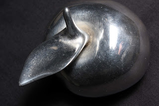
2013.04.27.ChromeApple (1)
f/14  1/80  ISO - 400
The tungsten light source, with no diffuser, was held close to the camera, above the subject.  The surface of the metal is unappealing and dull.  Also, the glare of the light reflected in the metal surface is unsatifactory, along with reflection of my hand.

2013.04.27.ChromeApple (2)
f/9  1/100  ISO-400
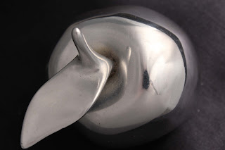
Using some tracing paper (A3) taped together, I made a cone of sorts and placed the wide end surrounding the subject, with the other end around the sides of the camera lens.  The light was moved to directly right of the subject.  The top areas look a lot more apealing, but the sides strucj directly by the light look dull and don't blend well.  There is less glare, and just a small reflection of the camera.
 
2013.04.27.ChromeApple (3)
f/9  1/160  ISO-400
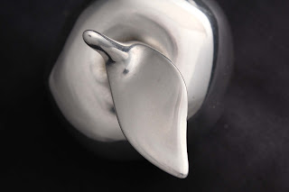
The light was moved directly behind and to the right, the subject adjusted slightly.  The different angles of the surface's contours have reduced the reflection of the camera to a  very small dot.  The surface texture is improved, although the right and bottom sides of the subject are still not right.
 
2013.04.27.ChromeApple (4)
f/9  1/250  ISO-400
The light was moved directly behind.  This made the edges darker, blending more into the background.  However, the top surface areas are dulled.
 
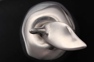
2013.04.27.ChromeApple (5)
f/9  1/30  ISO-400
The light was raised much higher (1.5-2m), positioned slightly to the left and behind.  The different contours of the surface are shown quite well, although the midtones on parts of the left edge look a bit odd.  There is some reflection of the camera, my hand and a support beneath the "leaf".

2013.04.27.ChromeApple (6)
f/5.6 /1/25  ISO-400
An umbrella diffuser was attached to the light, which was kept at the same hight but moved more to the left.  The surface has less of a metallic look to it now.  

2013.04.27.ChromeApple (7)
f/5.6  1/80  ISO-400
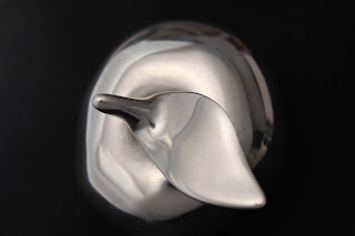
The umbrella was removed and the light positioned directly above. Unwanted reflections now appear around the right side edges towards the top.

2013.04.27.ChromeApple (8)
f/5.6  1/400  ISO-400
 
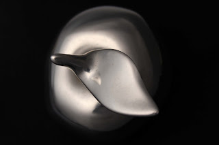
I lowered the light to about 30cm above the camera, and to the left.  The image is quite pleasing, with good tonal variations, showing the shape, and with no reflections.

2013.04.27.ChromeApple (9)
f/8  1/400  ISO-400
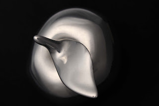
The light was lowered further, to about 10cm above the camera and as close as possible.  The subject was rotated round slightly for a better composition and to remove the shadow beneath the leaf.  I'm happy with this as the final image.

What I can learn from this exercise is that the light source should be large than the subject, when it has a shiny surface.  The best results also come from the light facing the subject directly, although I think this mayalso work with a light source below a diffused background, such as milky perspex.


Saturday 27 April 2013

Exercise - Outdoors at Night

2013.03.21.CroydonSkyline(Dusk).jpg
f/10 1/15 ISO-6400
The above image was taken in fading light, before the sun had disappeared completely.  With the ISO at its highest setting, a very slow shutter speed was still required for a moderate depth of field.  There is some noise, although not of great concern.  The buildings in the foreground are brighter in large part due to the close artificial lighting in the high street.

2013.03.21.CroydonSkyline(Dark).jpg
f/6.3  1/50 ISO-6400
In this second image of the Croydon Skyline, from a different angle, there is very little light left.  A lower shutter speed would have allowed for a narrower apperture.  However, this would have required the use of a tripod, making the desired composition not possible.  The foreground is not as bright as the first image, and the roof top areas blend into each other as dark shapes.  There is visibly less light in the image, even with a low f-stop and shutter speed.

2013.03.21.TownHallUnderCover.jpg
f/10  1/10  ISO-6400
The town hall was covered in sheeting during building works.  The tungsten lighting on the building created a warm orange glow, creating texture and interesting shadows.  I took several different shots of the building.  I chose this one for the blog as I like the effect of the blurred bus, with the movement slightly at odds with the calm ahead of it.

2013.03.21.StarryLights.jpg
f/13  1/13  ISO-6400
Tungsten street lighting shot with a slow shutter speed seems to make a quite pleasing star effect.  The brightness of street lighting and lit buildings can create interesting patterns when shot from a distance.  The dark foreground draws the viewer in towards the lights in the background.  The blue neon lines and the starry steet lamps leap out from the dark.

2013.03.21.BlueNeonBuilding.jpg
f/14 1/6  ISO-6400
Closer in to the blue neon building, and from a side view, this is a very different image.  Closer to the light, it was much brighter, enabling me to increase the f-stop and take a picture at a very slow shutter speed without the use of a tripod.  The slow shutter speed blurred the passing car, creating lines of light from its headlights.

2013.03.21.Space&Light(1).jpg
f/14  1/6  ISO-6400
2013.03.21.Space&Light(2)
f/9  1/6  ISO-6400
The above two images were taken outside a new building still being worked on.  Brightly lit and vacant, there were interesting patterns of light, space and shadows.  Looking at the first image you would think it was taken in mono.  In fact there was just naturally no colour in the frame.  There is just a very slight tint of colour in the second photo.

2013.03.21.Queen'sGardens.jpg
f/5.6  1/15  ISO-6400
Shooting from and across a low lighting position, the trees are just discernable shapes and the lights in the background are blurred.  The level of the lighting here captures some of the mood of this town centre park at night time.

2013.03.21 .Subway.jpg
f/7.1  1/15  ISO-6400
In this shot leading towards the subway entrance, a clear difference can be seen between the outside tungsten lighting and the fluoresent light inside the tunnel.

2013.03.21.FarifieldHalls.jpg
f/14  1/13  ISO-6400
2013.03.21.FarifieldHalls(DriveBy).jpg
f/5.6  1/6  ISO-100
The two photos of The Fairfield Halls show how a quite plain and ugly building can be transformed when lit up at night.  The second image has a quite bright glare around the middle of the building. This shows how the angle of view and position of the floodlights should be considered, as with any other lighting.

2013.03.21.Underpass (1)
f/20  1/3  ISO-6400
2013.03.21.Underpass (2)
f/20  1/3  ISO-3200
The two pictures of the underpass were taken with a low shutter speed, creating interest effects from the cars' lights, and reflections on the shiny surfaces.

2013.03.21MossBros.jpg
f/20  1/15  ISO-3200
A shop window is brightly lit from the inside.  The areas around the window, on the outside of the building, remain in dark shadow.

2013.03.21.TronBuilding (1).jpg
f/5.6  1/30  ISO-3200
2013.03.21.TronBuilding (2).jpg
f/5.6  1/30  ISO-3200
2013.03.21.TronBuilding (3).jpg
f/5.6 1/30 ISO-3200
2013.03.21.TronBuilding (4).jpg
f/5.6 1/30 ISO-3200
What I have labelled as the Tron Building was my favourite subject for this exercise.  The unusual design of building has many different shapes and angles, with interesting variation of light.  The mixture of internal lights and coloured external lighting blend well with the variety of shadows and angles, making some pleasing patterns.

2013.03.21.SurreyStreet (1).jpg
f/4.5  1/30  ISO-3200
2013.03.21.SurreyStreet (2).jpg
f/4.5  1/30  ISO-3200
The large plate glass shop front in the above image is lit fluorescently from the rear of a fairly large room.  This creates quite a bright glare, although softened by the calmer lighting at the front of the store.

2013.03.21.SurreyStreet (3).jpg
f/4.5  1/30  ISO-3200


Exercise - Tungsten & Fluorescent Lighting

Tungsten Light
  
After looking out of the window for a minute, with daylight fading, the light in the room appeared yellow / orange.  Looking outside again, daylight appeared blue. 
Setting the ISO to 100 and the aperture to its fullest (3.5) I found the shutter speed could be reduced to 1/6.  Increasing the shutter speed further made the exposure quite dark.
I then increased the ISO to 200, adjusting the aperture and shutter speed slightly, to take the following three images with varying white balance settings, as indicated.

 
2013.03.29.TungstenLight (1)
f/4.5 1/5 ISO-200
White balance: Auto

With the white balance set to auto, the light inside the room appears a little yellow, and there is a blue tinge to the outside view through the window.

2013.03.29.TungstenLight (2)
f/4.5 1/5 ISO-200
White balance: Daylight

 Now changing the white balance to daylight, the room appears very yellow / orange, while outside is still a bit blue it is less obvious than in the previous image.

2013.03.29.TungstenLight (3)
f/4.5 1/5 ISO-200
White Balance: Tungsten
The last image, with white balance set to tungsten, shows a more neutral and even light in the room.  Outside appears quite blue again, in fact more so than in the first image.
  
Fluorescent Light
 

2013.03.29.Kitchen-FluorescentLight (1)
f/11  1/8  ISO-1600
White balance: Auto

2013.03.29.Kitchen-FluorescentLight (2)
f/11  1/8  ISO-1600
White balance: Fluorescent
 In the first image under fluorescent light there is a slight green tinge.  This is most noticeable in areas of neutral colour, such as the chopping board behind the kettle.  There is some improvement with the white balance set to fluorescent for the second image, although not entirely corrected.


2013.04.02.Office(fluorescent) (1)
f/14  1/30  ISO-800
White balance: Auto
2013.04.02.Office(fluorescent) (2)
f/14  1/30  ISO-800
White balance: Fluorescent
 I was told that the lights in the office where I work are supposed to replicate natural light, so thought it would be interesting to perform the exercise there.  Also, the neutral tones should show the difference in the colour of the light.  A messy office isn't the most appealing of subjects, so I chose to incude the lights themselves in the composition.
In the first image, with white balance set to auto, there is a very clear green tinge.  This is largely corrected in the second image with the white balance changed to fluorescent, although I would not say that all colours are totally true to reality.  One other thing I noticed while scanning the room throught the view finder was how uneven the lighting is in this room, despite a pretty even spread of very bright lights.  This was not so noticeable to the naked eye.