Having completed the previous assignment in black and white, the chapter on colour and the following assignment required a fresh perspective. It took me much longer to complete, finding an abundance of some colours and combinations, with others harder to find and requiring more consideration.
Certainly, searching for various colour combinations, it was found in some unexpected places. I learnt to appreciate how much there is around us that could easily be overlooked, or taken for granted. Understanding the different relationships between the six principle colours that form the colour circle, I feel I have developed my composition of images in colour. This will help make more informed choices of when to use colour or monotone, although I appreciate that any desired message or theme may also be considered.
Good use of colour may not simply be aesthetically pleasing, it depicts a mood or ambience. The colours in an image themselves can contrast with the subject matter, sometimes to dramatic effect. Overall, I am pleased with my assignment for this chapter. At times I wondered where I was going to find all of these colour combinations. However, I kept looking in different places, experimented and persevered with the winter weather. Certainly, the weather conditions and time of day, creating different lighting conditions, effect natural colours outdoors. Similarly, lighting has a big impact on the intensity of colours chosen for indoor photography. I often favour natural light, but with one still life image, in dull light, found how the use of flash really brought out the intensity of the colours. So this moves me nicely on to the next chapter on light.
Showing posts with label The Art of Photography: Part Three - Colour. Show all posts
Showing posts with label The Art of Photography: Part Three - Colour. Show all posts
Tuesday, 19 February 2013

Sunday, 6 January 2013
Exercise - Colours into tones in black and white
The original colour photo
 |
| 2013.01.05.ColoursIntoTonesInB&W f/6.3 1/30 ISO-2500 |
Neutral tones in black & white
 |
| 2013.01.05.ColoursIntoTonesInB&W-neutral |
"Red filter" in black & white
 |
| 2013.01.05.ColoursIntoTonesInB&W-"Red filter" |
"Green filter" in black & white
 |
| 2013.01.05.ColoursIntoTonesInB&W-"Green filter" |
"Blue filter" in black & white
 |
| 2013.01.05.ColoursIntoTonesInB&W-"Blue filter" |
This exercise really showed me how much control you can have over adjusting tones in an image. Unfortunately, Adobe Photoshop Elements 8.0 does not have a 'yellow filter' slider in its grayscale converter, so I was unable to create an image with a higher relative amount of yellow. However, I did notice while creating the 'red filter' image that the tones of the lemons were also lightened as more red was added. Similarly, with the blue and green filters they were less effected by alteration of the independent filters than the red and yellow subjects. Each colour filter slider has an effect on all of the colours, lightening the tone of the corresponding colour and darkening the others.
Different moods and impressions can be achieved through variation of each colour slider. The image in neutral tones is the least dynamic in this exercise. In my view, the most interesting images are the 'red filter' and 'blue filter' photographs. The stronger contrasts are quite eye catching and bold. The simplicity of fewer, bolder tones works rather well.
Saturday, 29 December 2012
Exercise - Colour Relationships
Primary & Secondary Combinations
Red & Green
 |
| 2012.12.02.ColourRelationships-Red&Green f/14 1/100 ISO-500 |
The bright sunlight shining on the post box made the red colour appear weaker. The top of it benefits from a higher saturation, and blends well with the richer green of the top half of the hedge.
Blue & Orange
 |
| 2012.12.22.ColourRelationships-Blue&Orange f/8 1/50 ISO-3200 |
This is a slightly abstract shot of an orange watering can and the blue wires of an extension socket. With nothing else in the frame, the relationship of the two colours is intense and the main focus of the image. The dark shadows highlight the blue, as well as accentuating the diagonals and curves of the watering can.
Yellow & Violet
Yellow & Violet
 |
| 2012.12.22.ColourRelationships-Yellow&Violet f/8 1/50 ISO-3200 |
Although the ratio of yellow to violet is perhaps more than 1:3, this is compensated by variations in the intensity of violet, due to lighting, and the brightness of the yellow.
Other Selected Colour Combinations
Other Selected Colour Combinations
Red, Yellow & Blue (with a touch of beige / brown)
 |
| 2012.12.17.ColourRelationships-Red, Yellow & Blue f/10 1/60 ISO-1250 |
The three primary colours of red, yellow and blue are at work here, while not in accordance to the ratios suggested by J W Von Goethe. With the biggest area covered by the yellow wall, the red stands out the most, althouth the yellow writing is well balanced against the red.
I think the blue of the girl's jacket works better with the yellow, than the red. With yellow being a much brighter colour, there is an imbalance from the small amount of the much darker blue. It's more or less a role reversal in this colour relationship, which I feel adds some interest. The soft beige coloured elbow and shoulder pads complement the blue and are highlighted by a similar shade within the shop.
Pink & Silver / Grey
I think the blue of the girl's jacket works better with the yellow, than the red. With yellow being a much brighter colour, there is an imbalance from the small amount of the much darker blue. It's more or less a role reversal in this colour relationship, which I feel adds some interest. The soft beige coloured elbow and shoulder pads complement the blue and are highlighted by a similar shade within the shop.
Pink & Silver / Grey
 |
| 2012.12.23.ColourRelationships-Pink&Silver f/8 1/30 ISO-1250 |
I like the contrast of bright colours with soft, neutral colours. The pink only fills a small part of the frame, and so is well balanced with the silver can and soft, shaded background.
Yellow & Orange
 |
| 2012.12.25.ColourRelationships-Yellow&Orange f/6.3 1/30 ISO-3200 |
Saturday, 22 December 2012
Exercise - Primary & Secondary Colours
Primary & Secondary Colours
Green
 |
| Green-1: Normal Exposure |
 |
| Green-2: Lighter |
 |
| Green-3: Darker |
Orange |
| Orange 1: Normal Exposure |
 |
| Orange 2 - Darker |
 |
| Orange 3 - Lighter Red |
 |
| Red 1 - Normal Exposure |
 |
| Red 2 - Darker |
 |
| Red 3 - Lighter |
Violet
 |
| Violet 1 - Normal exposure |
 |
| Violet 2 - Darker |
 |
| Violet 3 - Lighter |
Yellow
 |
| Yellow 1 - Normal Exposure |
 |
| Yellow 2 - Darker |
 |
| Yellow 3 - Lighter |
Blue
 |
| Blue 1 - Normal Exposure |
 |
| Blue 2 - Lighter |
 |
| Blue 3 - Darker |
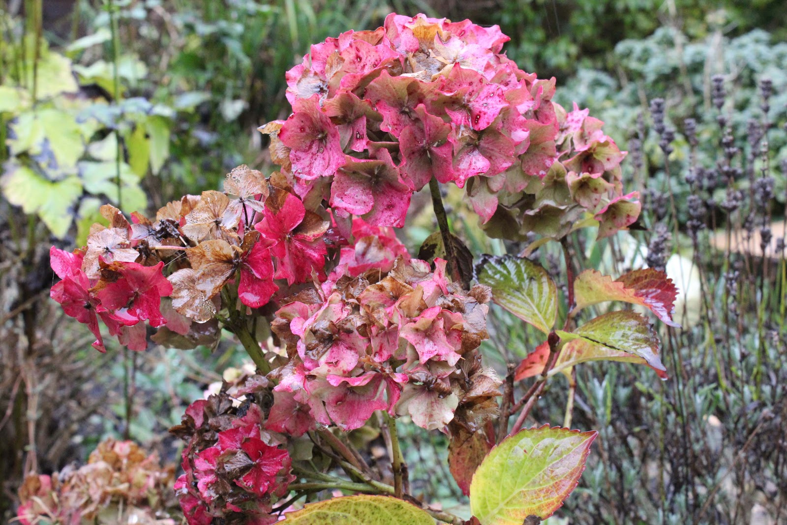
Tackling this exercise in winter, there was not the abundance of colour that could have been available a few months ago. The photos taken for orange, perhaps appear more brown than orange. I'm fairly sure brown does derive from orange though, and it's the closest I could find from natural subjects, without resorting to shooting something man made.
Looking across the range of colours, it appears that bolder contrast between colours can be achieved with normal to darker exposures. Lighter exposures appear much softer and with certain colour combinations could work well. Overall, I generally prefer the stronger colours created through normal or darker exposure. However, a lighter exposure can create an appealing mood or atmosphere, which may be more appropriate for certain images.
Monday, 12 November 2012
Exercise - Control the strength of a colour
 |
| 2012.11.10.RedPhoneBox(1) f/5 1/40 ISO-3200 |
 |
2012.11.10.RedPhoneBox(2)
f/5.6 1/40 ISO-3200 |
.JPG) |
| 2012.11.10.RedPhoneBox(3) f/6.3 1/40 ISO-3200 |
 |
| 2012.11.10.RedPhoneBox(4) f/7.1 1/40 ISO-3200 |
 |
| 2012.11.10.RedPhoneBox(3) f/8 1/40 ISO-3200 |

In this series of photos, the f/stop was gradually increased, letting less light through the lens and progressively darkening the exposure of the images. The first image, set to a normal exposure, appears quite bright, although the red is quite weak and unsaturated. The red hue of the phone box becomes increasingly dark and more intense through the higher f/stops.
Thursday, 27 September 2012

The first thing I want to say here is something I heard on a TV documentary, Perspectives, in which David Suchet follows in the footsteps of his grandfather, Fleet Street photographer Jimmy Jarche. The best piece of equipment any photographer has is his own eyes. It's not what you see, but how you see it. Seems like a good attitude to me!
This blog is a continuation of my learning log, following on from the first assignment on contrasts. No more bad hand writing, photocopying and scanning.
Subscribe to:
Posts (Atom)