Saturday, 27 April 2013

Exercise - Variety with a low sun

 
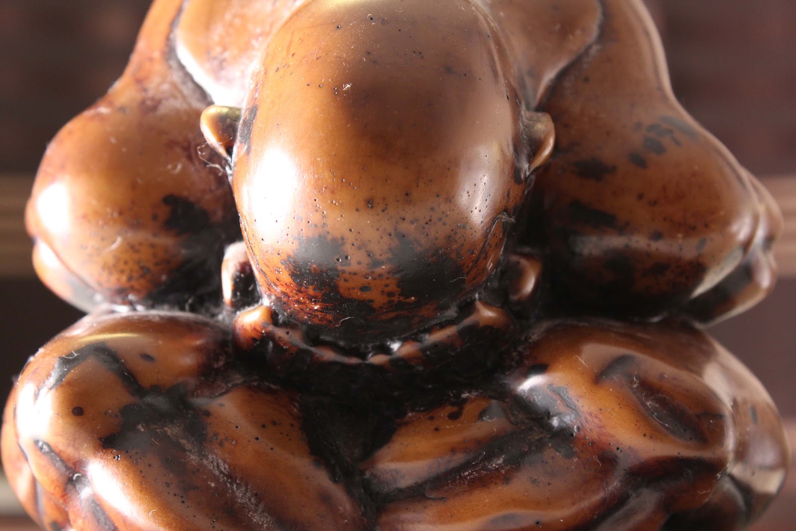
Frontal lighting 
2013.04.23.AlienHead-FrontLighting
f/5.6  1/50  ISO-100
I held the camera down low, reaching from one side, and using the display to compose the image.  This avoided shadow from myself or the camera crossing the subject or background.  There is strong reflection of light down the centre of the subject.


Side lighting
2013.04.20.AlienHead-SideLighting
f/5 1/100 ISO-100
With the sun to the left, the lit side of the subject provides a contrast to the dark side and background.
 

Back lighting
2013.04.06.AlienHead-BackLighting
f/5.6  1/1600  ISO-100
With the sun behind the subject it is mostly just a silhouette, which shows its shape well.  Increasing the distance from the subject, or darkening the exposure would reduce the detail further.  However, I found it quite appealing retaining a small amount of light and detail.
 
Edge lighting
 
2013.04.23.AlienHead-EdgeLighting
f/5.6  1/60  ISO-100
 The sun was just out of the frame, behind and to the right of the subject.  The silhouette of the tree behind provides a dark backgound where the edge lighting is visible.


Exercise - Light through the day

I chose a 16:9 aspect ratio, to reduce the amount of plain grass foreground, and fill the width of the frame with more of the farm buildings.  This viewpoint was decided on to see different sides and angles of the buildings, which should show how the changing light impacts on the scene.  The comments beneath each photo summarise my impressions at the time of taking them.

2013.04.20.Farmbuildings (1)
Time: 08.27  f/11  1/250  ISO-100
Most areas in image (1) are lit well, with shadows just in the internal and covered areas of the barns.  The light was quite warm in temperature

2013.04.20.Farmbuildings (2)
Time: 09.37  f/11  1/200 ISO-200
The front side of the middle building is now in shadow, with the struts just visible, adding a more three dimensional quality to the image.

2013.04.20.Farmbuildings (3)
Time: 10.34  f/11  1/200  ISO-100
The internal / front parts of the buildings, and side of the left hand building, are now all in shadow.  There is greater contrast than in the earlier images.

2013.04.20.Farmbuildings (4)
Time:  11.41  f/11  1/200  ISO-200
Foreground shadows have more or less gone.  There is greater texture and definition on the highlights.

2013.04.20.Farmbuildings (5)
Time:  12.36  f/11  1/200  ISO-100
Here the detail is stronger again and there is greater texture.

2013.04.20.Farmbuildings (6)
Time: 13.33  f/11  1/200  ISO-100
The side of the main building and the one to the right are a bit darker.  There is fairly strong contrast, detail and texture.

2013.04.20.Farmbuildings (7)
Time:  14.33  f/11  1/160  ISO-100
The sides are much darker now, and only just distinguishable from the front.  The image is starting look more two dimensional again.

2013.04.20.Farmbuildings (8)
Time: 15.38  f/11  1/250  ISO-100
There is some highlights on the roofs, the rest is mostly shadow, with little colour.

2013.04.20.Farmbuildings (9)
Time: 16.37  f/11  1/250  ISO-100
The middle and right buildings are virtually just silhouettes now.

2013.04.20.Farmbuildings (10)
Time: 17.33  f/11  1/320  ISO-100
The buildings are still dark but there is warmth in the foreground.  The sky is a little less blue.

2013.04.20.Farmbuildings (11)
Time: 18.32  f/11  1/320  ISO-100
There are soft, warm tones in the foreground.  Buildings are dark apart from some tonal variation on the middle roof.

2013.04.20.Farmbuildings (12)
Time: 19.27  f/11  1/400  ISO-100
The sun is low and behind the building on the right.  The soft rays of light from the sun across the buildings has quite a pleasant effect, and I like the golden light on areas of the foreground.  The buildings and trees are obviously all silhouetted.

2013.04.20.Farmbuildings (13)
Time: 19.50  f/11  1/125  ISO-100
The foreground is now in shadow and starting to blend in to the silhouette of the buildings.  There is a small amount of light from the sun, almost disappearing behind the right side building. 

2013.04.20.Farmbuildings (14)
Time: 19.58  f/11 1/80  ISO-100
 Again the buildings and foreground are all in shadow.  It would have been nice if the sun was this side of the building.


I thought I may have preferred the first shot of the day.  This is perhaps the most balanced shot, although reviewing them all later I like 12 & 13, which are very different.  It's quite hard to chose the one I now like the most.  I like number 9.  The colours are soft, while there is enought contrast and tonal variation to keep it interesting.  The photos around the middle of the day are quite interesting,as there is strong contrast and texture.  I think I just prefer the light at the end of the day.  In hindsight, I would have liked to have composed the photos in a way that would have seen the low sun striking the buildings.  This is obviously something to consider in the future, taking into account the position the sun will be in at different times through the day.

Exercise - Judging Colour Temperature

Part One
2013.04.14.Oyster (sunlight)
f/9  1/640  ISO-100

2013.04.14.Oyster (shade)
f/9  1/100  ISO-100

2013.04.20.Oyster (low sun)
f/5  1/125  ISO-100
I wasn't really surprised with what I saw at the time, or the outcome comparing photos later.  The light in the sun is warmer than in shade, and with the low sun warmer still.  The differences are more apparent looking at the images later, as your eyes adjust to the different conditions at the time.  The light in the shade is more blue.
 
 
Part 2
2013.04.14.Rock (shade-autoWB).jpg
f/9  1/50  ISO-100

2013.04.14.Rock (shade-daylightWB).jpg
f/9  1/50  ISO-100

2013.04.14.Rock (shade-shadeWB)
f/9  1/50  ISO-100
 Of the above three images taken in the shade, the auto white balance is least appealing to me. The shade white balance setting gives the warmest image, and daylight fairly neutral. With the backrground fairly neutral as well, the last image works best for me, as the subject is more distinguishable from the background
 
2013.04.14.Rock (sun-autoWB).jpg
f/9  1/800  ISO-100

2013.04.14.Rock (sun-daylightWB).jpg
f/9  1/640  ISO-100

2013.04.14.Rock (sun-shadeWB).jpg
f/9  1/640  ISO-100
With the WB set to shade, the above image in full sunlight was warmer than with the daylight and auto settings.  This does really make sense, as the daylight and auto settings compensate and tone down the warmth, while the shade setting does the opposite.  I liked this image more than the other two, although with WB set to daylight the image is a truer representation of the actual subject.  In some circumstances this may be more desirable.
 
2013.04.20.Rock (lowsun-autoWB)
f/4.5  1/100  ISO-100

2013.04.20.Rock (lowsun-daylightWB)
f/4.5  1/100  1/100

2013.04.20.Rock (lowsun-shadeWB)
f/4.5  1/100  1/100
The above three images with the sun low follow the same pattern as the other two sets, although there is not much between the auto and daylight white balance settings.  The shade WB setting is the warmest again.  I like the last image, although it is perhaps unnaturally orange, and I think the first image with auto white balance is the most balanced of the three photos.  Clearly it may be desirable to tone down the colour temperature for other subjects and scenes, so I would not always choose to add warmth through white balance variation.


Saturday, 13 April 2013

Exercise - Concentrating light

I started off with a 400w tungsten light, extending the stand up to the ceiling and positioning it as far from the subject as possible.  However, it was still too close and the whole room illuminated.  As I don't have a remote as yet, it would have been rather awkward trying to set up the shot on timer and block some of the light etc. 
I decided to use a slave flash and made a roll of black card, approximately two meters long, which I attached to the flash with some masking tape.
For the first image, my only option was to balance the flash on stairs to the right.  Ideally the light source would have been further away.  The illuminated area was very bright.  Toning down the brightness of the highlights in post production helped, although I would have still liked the right side of the binnocular case a bit darker.  Overall, I think the image works quite well.  Concentrating the light on the case focuses attention on it.  The light appears quite natural, as if some sunlight has come through a gap in curtains.  I chose to convert this to monotone afterwards, as I felt it showed the variation in tone much better.
The second image had the flash positioned to the left of the binnoculars, and only slightly higher.  The light skimmed the top of the binnoculars, illuminating an area of the table in between , with shadow covering part of the area the other side.  Concentrating light on the binnoculars certainly makes them the central focus of the image.

2013.04.13.BinsOnBureau
f/4.5  0.6  ISO-3200

2013.04.13.BinsOnTable
f/5.6  1/5  ISO-6400

Wednesday, 10 April 2013

Exercise - Contrast and Shadow Fill

 
As per the instructions, the set up had the camera level with the subject, on a tripod, and the light source to the left of the subject, at right angles to the camera.  The light was approximately 3m from the subject.

2013.04.09.Contrast&ShadowFill (1)
f/8  1/20  ISO-800
Taken with no diffuser.
2013.04.09.Contrast&ShadowFill (2)
f/8  1/20  ISO-800
With a diffuser (umbrella).
2013.04.09.Contrast&ShadowFill (3)
f/8  1/10  ISO-800
With a white card (2'x3') opposite the light, 3m from the subject.
 

2013.04.09.Contrast&ShadowFill (4)
f/8 1/10 ISO-800
White card now positioned 1.5m from the subject.

2013.04.09.Contrast&ShadowFill (5)
f/8 1/10 ISO-800
White card now covered with foil, dull side facing out.
2013.04.09.Contrast&ShadowFill (6)
f/8 1/10 ISO-800
White card now covered with foil, shiny side facing out.
2013.04.09.Contrast&ShadowFill (3)
f/8 1/10 ISO-800
The foil was crumpled, smoothed out and placed over the white card again, shiny side facing out.
The most contrasty image is (1), with no diffuser or reflector.  Then I would put them in the following order: (2), (3), (5), (4), (6), (7).  The dull side of the foil appears to reflect less than the white card, so providing less shadow fill.  The shiny foil seems to fill more shadow after crumpling and smoothing it out.  I think perhaps the light reflects at a greater number of angles, so covering more area of the subject.

The contrast could have been increased by moving the naked light further from the subject, or placing black card opposite the light.  Black velvet reflects less light still, so would work even better than card.  I should consider the walls opposite the light source, and ceilings, as they also act as reflectors.  A second light would obviously lighten the shadows more.


Monday, 1 April 2013

Exercise - The Lighting Angle

 
2013.03.31.FamilySculpture (1)
f/5.6  1/30  ISO-200
Light position: Front (behind camera)
2013.03.31.FamilySculpture (2)
f/5.6  1/40  ISO-200
Light position:  Direct left
2013.03.31.FamilySculpture (3)
f/5.6  1/50  ISO-200
Light position:  Directly behind
2013.03.31.FamilySculpture (4)
f/5.6  1/25  ISO-200
Light position: To one side (behind and to the right)
2013.03.31.FamilySculpture (5)
f/5.6  1/50  ISO-200
Light position:  Front & raised - 45 degree angle downwards
2013.03.31.FamilySculpture (6)
f/5.6  1/50  ISO-200
Light position:  Direct left & raised - 45 degrees downwards
2013.03.31.FamilySculpture (7)
f/5.6 1/8 ISO-200
Light position: Directly behind & raised - 45 degrees downwards

2013.03.31.FamilySculpture (8)
f/5.6 1/15 ISO-200
Light position: To one side & raised - 45 degrees downwards

2013.03.31.FamilySculpture (9)
f/5.6  1/50  ISO-100
Light position:  Directly above


2013.03.31.FamilySculpture (10)
f/5.6  1/50  ISO-100
Light position:  Above & slightly to the front


2013.03.31.FamilySculpture (11)
f/5.6  1/50  ISO-100
Light position:  Above & slightly behind


Shooting from the side seems to best show the form of the subject.  Raised from the side maintains the three dimensional qualities of the form, while also revealing more details in the highlights.
Image (3), with the light behind creating a silhouette is quite effective and shows the overall shape well.  Keeping the light behind, and move it to the side shows off the edges.
When the light was raised and pointing downwards 45 degrees, I needed to move the light back further from the subject, but did not have the room where I was working.  Without over exposing the image, the umbrella prongs were visible.  In future, I will make sure there is plenty of room around the table to allow for moving the light source further from the subject. 
I like the contrast in the shot with the light behind and to one side.  From the front, including above, the lighting is more even, so there is little contrast.  With the light positioned above and slightly behind, some light areas add form and detail to the silhouette.
Although the exposure is not as desired for image lit from a raised position to one side, I can see the potential in the lighting from that direction.  The photo lit from above is fairly balanced, showing detail while also providing some contrast.  However, I think I prefer the higher contrast that positioning the light to one side affords.  Obviously, introducing a second light source into the equation will give further control and more options to choose from, for whatever the desired effect.